The Obamas’ two speeches at this year’s Democratic National Convention were powerhouse show-stoppers in their own right, but the true star of the DNC was the stunning set design. Both in built form and digital form, the DNC’s stage, motion graphic, and lighting designs captured our attention and held it with elegant strength for four days straight. It’s been proven that over 90% of communication is non-verbal. And it’s for this reason that the art director behind the DNC’s stage design faced an enormous challenge when he took the job — how to create a visual design and style for the convention in order to subliminally maximize as much party unity as possible (i.e. to calm all those riled up Bernie Sanders delegates), as well as imbue Hillary’s nomination and message with strength, clarity, power, and beauty.
In the age of televised events — whether it be the Oscars, the Emmys, or the DNC — a surprisingly difficult hurdle for the art director in charge is how to give the background an impressive style during a tight camera shot without distracting attention from the person getting the close-up. And when the camera pulls away for the wide shot, that same set has to wow the viewer in a totally different scale. On top of this, for an event as massive and as long as the Democratic National Convention (4 days), another challenge emerges for the designer — hundreds, possibly thousands, of different camera angles catching your stage from every possible direction.
It’s a huge design feat for any one person, and this year the person in charge was Bruce Rodgers of the Los Angeles-based design firm, Tribe, Inc. You most certainly recognize the company’s work from other major television and live events. Tribe, Inc. was the design firm of choice behind all of the most recent Democratic National Conventions as well. Not to mention: Kanye West’s “Watch The Throne” World Tour, Madonna’s “Drowned World” Tour, the Grammy Awards, countless HBO specials, the ABC World News Tonight set, Rihanna & Eminem’s “Monster Tour”, Lady Gaga’s Super Bowl performance of the Star Spangled Banner, and more Super Bowl Halftime Shows than you can count — including the recent one by Coldplay, Beyoncé and Bruno Mars.
For Bruce Rodgers, first and foremost, the #1 most important creative decision that had to be locked down for the DNC’s set design was the concept itself. What kind of motif could possibly be all-encompassing enough to make 30 million viewers feel warm and fuzzy, all while reflecting an aura of strength and power at the very same time? Rodgers and his team made the brilliant choice of using the symbolic visual qualities of wicker weaving to hit the message out of the park and straight into the hearts of viewers.
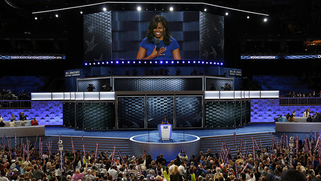
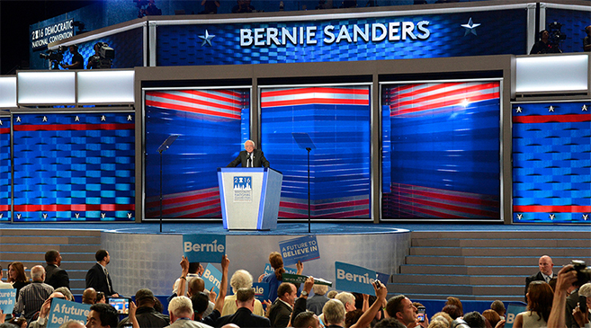
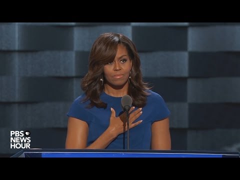
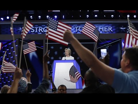
Wicker, an ancient Egyptian art form that holds a timeless quality, also carries an American as apple pie warmth. It was there behind Michelle Obama as she effortlessly destroyed Donald Trump. It was there behind President Bill Clinton as he chronicled the extraordinary life story of his wife, and it glowed unassumingly in shades of blue and gold for the entire convention. Christopher Hawthorne, architecture critic for the Los Angeles Times writes, “More meaningful in terms of the struggle for togetherness in Philadelphia has been the imagery spilling across the huge digital video boards set up behind and above the podium, particularly the woven, wicker-like design that has emerged, oddly enough, as this convention’s dominant visual symbol. Though its precise shade has shifted from speaker to speaker — sometimes navy blue, others a sensible gray — the basket-weave pattern provided a consistent unspoken message: The goal this week is not so much to quash the rebellious pro-Bernie contingent as to knit it into the fabric of party unity. Let the shouters shout. The set design aimed to look one step ahead, ready to turn arguments seemingly at cross purposes into a picture of diverse cooperation.”
Apart from the concept of the DNC’s stage design, from a technological standpoint high-resolution digital screens — such as the ones incorporated into the stage design at the DNC — have been quietly revolutionizing televised events and stadium-scale shows in recent years. Attend any major concert tour these days and you will be blown away by the high-res LED motion graphics and high-quality digital projections on full display in front of your eyes. A far cry from where we were just 5 years ago. In fact, the LED panels used in televised events are so high-res that it’s now almost impossible to distinguish between what’s a physical set in the background and what’s a digital graphic. It wasn’t until Michelle Obama’s speech was over that I realized the sparkling royal blue wicker background was coming from a digital screen and wasn’t a physical wicker wall at all.
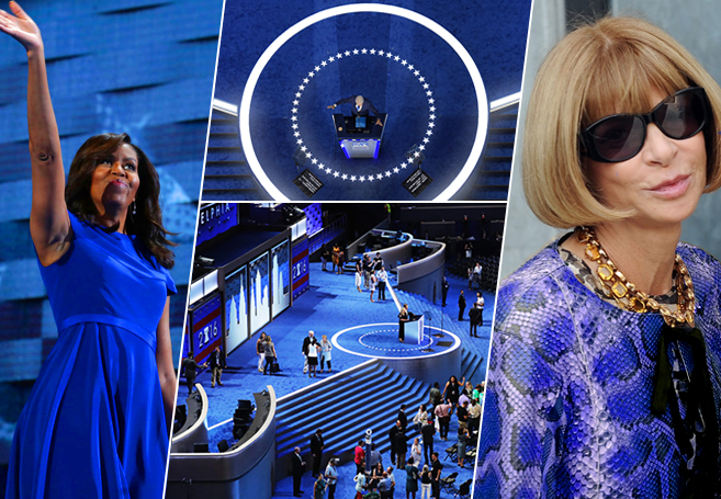
It’s also worth noting that blue is perhaps the most psychologically powerful color of all. Blue is the primary color associated with intellectualism and intelligence, and is the strongest with: communication, trust, efficiency, serenity, duty, logic, coolness, reflection, and calm. “Blue is the colour of the mind and is essentially soothing,” according to Color Affects. “It affects us mentally, rather than the physical reaction we have to red. Strong blues will stimulate clear thought and lighter, soft blues will calm the mind and aid concentration. Consequently it is serene and mentally calming. It is the colour of clear communication. Blue objects do not appear to be as close to us as red ones. Time and again in research, blue is the world’s favorite colour.”
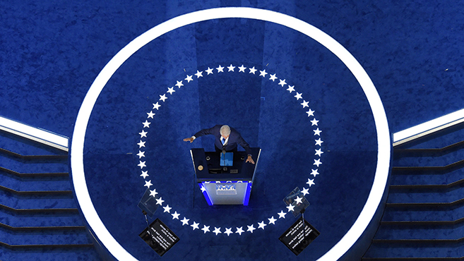
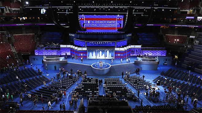
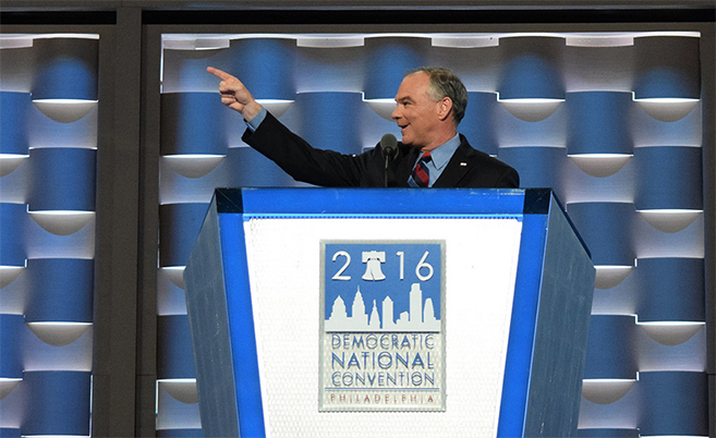
During Tim Kaine’s speech and others, the background digital wall panels rotated and a physical, rather than a digital, weaving pattern emerged. And during President Obama’s speech, as well as Hillary’s, the digital screens were filled with a softly blurred close-up of the American flag’s white star and blue corner section. Wide shots and top shots revealed the angular thrust chevron stage with its glowing white ring encircling the podium.
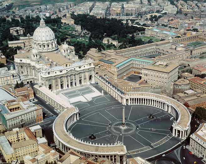
With regards to massing and form, the DNC’s stage was sort of like a combination of a three-tiered wedding cake stack, fused with the hugging side-wing arms akin to Bernini’s colonnaded porticos designed in 1635 which flank each side of the Vatican’s piazza symbolizing the “maternal arms of Mother Church.” Instead of Michelangelo’s 1547 dome sitting atop, the DNC chose a giant LED central screen. And instead of the Vatican’s ancient Egyptian obelisk front-and-centre, there was the angular glowing podium with its alternating keynote speakers.
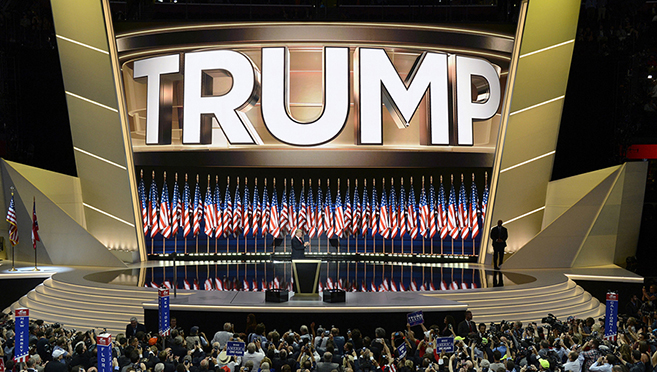
If the DNC stage was a reflection of unity and elegance, the RNC’s stage for Trump was the opposite. “When viewed as a whole,” writes Michael P. Hill of Newscast Studio, “the visual connections to everything from crowns to eagles to space age aircraft and Spartan (or Iron Man?) helmets could be found — all of which created the image of power, strength and perhaps even fear — a theme that many pundits pointed out was a prominent message in the Republican’s speeches.That bold, in your face design philosophy also extended to the design of the graphics and animations fed to the various on-stage screens. Perhaps the most obvious example of this was the large ‘TRUMP‘ that was, quite literally, jammed into the screen and rendered in thick, bold metallic 3D letters that seemed to bulge off the screen. Tight letter spacing made the word seem even larger — perhaps a not-so-subtle nod to Trump’s larger than life character. The Cleveland design also moved the wings of tiered seating for party officials out of the spotlight as essentially independent of the stage design, perhaps a way to keep the focus on the stage and its personalities.”
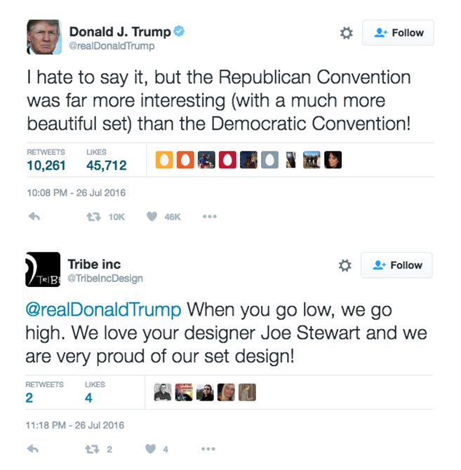
Forever a douchebag, Donald Trump was quick to bash the design of the DNC stage, tweeting: “I hate to say it, but the Republican Convention was far more interesting (with a much more beautiful set) than the Democratic Convention!” And taking the high road in response, the team at Tribe Inc. tweeted their reply: “When you go low, we go high. We love your designer Joe Stewart and we are very proud of our set design!”
And on another design side note, I recently learned why Hillary Clinton’s personal style has taken an noticeable leap forward in recent months. As it turns out, VOGUE Editor-in-Chief Anna Wintour is quietly serving as Hillary’s own personal fashion stylist behind the scenes. When it comes to the convergence of fashion and politics it doesn’t get much more impressive than that, folks! You can read the full fascinating story entitled “Styling Politicians In The Age Of Image Wars” at BusinessOfFashion.com. And be sure to also read WIRED‘s terrific piece entitled “The Hidden Meanings Behind The Set Designs Of The RNC & DNC.” (Photo credits: Carolyn Cole / Los Angeles Times; Mark J. Terrill / AP; Chip Somodevilla / Getty; ArtsAndFacts.blogspot.com; Alex Wong / Getty; ABC News)
SEE ALSO: Watch Bill Maher Destroy Whiny Donald Trump In This Brilliant “Lady Trump” Commentary
SEE ALSO: Make America Hate Again: How THE WITCH’s Black Phillip Goat Is A Tragic Metaphor For Donald Trump
SEE ALSO: The Women On Top Theory: When Women Reach 20-30% Of Institutional Power, Progress Always Skyrockets
.