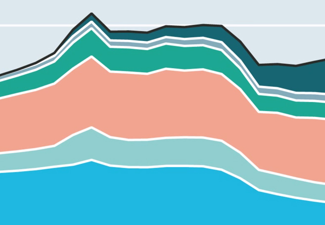
Times, they are a-changin’. Nowhere is this more evident than in the world of advertising over the past 35 years. So how exactly have advertising revenue streams changed since 1980 exactly? The team at The Economist put together this fascinating animated chart which breaks it down in full fascinating detail. The animated infographic comes from The Economist’s September 2014 article entitled “Little Brother” which you absolutely must read by visiting TheEconomist.com.
Watch This Fascinating Graph Showing What’s Happened To Advertising Revenue In America Since 1980
Brent Lambert
Writer, editor, and founder of FEELguide. I have written over 5,000 articles covering many topics including: travel, design, movies, music, politics, psychology, neuroscience, business, religion and spirituality, philosophy, pop culture, the universe, and so much more. I also work as an illustrator and set designer in the movie industry, and you can see all of my drawings at http://www.unifiedfeel.com.


