The movie studio logos that play during the beginning of a film have been part of the movie-going experience since the very start. And in all this time, many of these logos have stayed true to their original design, undergoing minor refreshing from time to time. In a feature published yesterday, CNN takes a look at the history of these beloved graphic openers and reveals some fascinating backstories that might surprise you.
For instance, CNN writer Wook Kim tells the story of the Paramount Pictures mountain known as ‘Mount Majestic’: “According to industry lore, Paramount’s enduring symbol—the “Majestic Mountain”—evolved from a sketch on a scrap of paper by “the Man Who Invented Hollywood,” W.W. Hodkinson. (Ben Lomond Mountain in Utah is thought to be the inspiration, though the latest versions are supposedly modeled on a peak in the Peruvian Andes. What’s also changed over the years is the number of stars that form the semi-circular constellation around the peak. The original logo had 24 stars (for each of the two dozen actors under contract in 1916). The latest version now has 22.”


Other stories include how Warner Brothers first introduced the classic shield with the letters “WB” in 1927. Although the shield was prominent, the letters were originally quite small and held little prominence on the bottom of the screen. So in 1937 the letters were bumped up in scale and filled the shield entirely and featured a cloud-filled sky in the background. This has been the logo’s mainstay ever since. One interesting note is the 8-chord jingle that opens the graphic, and which first appeared in 1999, comes from the iconic song “As Time Goes By” from the classic Casablanca.


The logo of Columbia Pictures has always used a central figure on a platform, with the first being a Roman soldier in 1924. From 1928-1936 a ceremonial headdress was added, and from 1936-1976 the figure was draped in an American flag. In 1992 the logo underwent a major redesign when illustrator Michael Deas was commissioned to bring it up-to-date. The signature Torch Lady as we know her today was introduced, and as a basis for the illustration Deas photographed a Louisiana homemaker as his model.


Universal Pictures has always held the Earth in prominence with their logo since its creation in 1927. In its early years a plane was seen flying around the spinning globe, and there have been phases throughout the years where cloudy Van Allen-type radiation belts were added. The studio’s brand new 100th anniversary logo underwent its most recent transformation with the addition of a photo-realistic version of Earth and a much more elaborate and ornamented theme song.


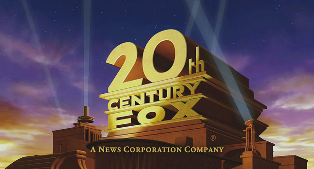
20th Century Fox‘s logo has consistently used a giant Art Deco-style facade combined with searchlights, and was first created by matte artist Emil Kosa Jr. (Kosa later painted the Statue of Liberty seen in the finale of 1968’s Planet of the Apes). The logo underwent two reiterations of computer modelling, one in 1994 and the latest in 2008. But the logo is perhaps best known for its blaring trumpet music entitled “Fox Fanfare” which was composed by Alfred Newman in 1933. For decades the song disappeared from association with the logo, that is until 1977 when George Lucas reintroduced in the opening credits of Star Wars with an updated version arranged and recorded by John Williams.
TO READ THE FULL GALLERY OF ALL 10 MOVIE LOGO BACKSTORIES VISIT CNN.COM.
SEE ALSO: Universal Pictures™ Celebrates Its 100th Anniversary With Brand New Logo And 13 Film Restorations