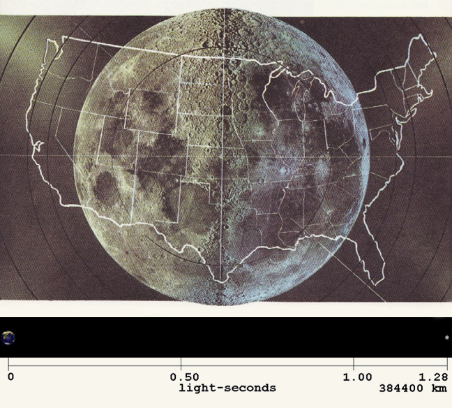
When I stumbled across the following image showing a scaled comparison of the United States superimposed with an image of the Moon, I was seriously impressed. Sometimes I find myself fascinated by various cities, and in order to get a grasp of how big they are compared to my home city here in Montreal I will often overlay a map of the two cities together just to get a sense of relative comparison. So when I saw this U.S-Moon graphic the first thing that ran through my mind was, “Why the hell didn’t I think of this myself?” For some reason I had always imagined the Moon being much bigger than this, but as it turns out, the Moon’s diameter and the width of the United States are strikingly similar. Also, take a look at the chart showing the Moon’s distance from the Earth.
SEE ALSO: Watch CBS NEWS’ Fascinating Profile Of The Astronaut Wives Of The 1960s
SEE ALSO: 4 Earths Wide: Cassini Captures Technicolor Images Of Saturn’s Mysterious Hexagon-Shaped Hurricane